The color decision is the one that stops more siding projects than any technical question. Materials get chosen. Contractors get vetted. Estimates get approved. And then a homeowner stares at a binder of color chips and cannot move forward.
That paralysis is not a character flaw. It is a framework problem. Choosing house siding color feels overwhelming when you approach it as a blank canvas with hundreds of options. It becomes manageable the moment you start with the fixed elements of your home and work outward from there. The James Hardie color selection guide reinforces the same principle: great color combinations come from understanding what already exists on the home, not from choosing a favorite color in isolation.
This is the framework Ridge Top's design consultants use on every project. It applies to fiber cement siding, engineered wood siding, and vinyl, and it works whether your home is in Brookfield, Gurnee, or Tampa.
Start With What You Cannot Change
Every residential siding color decision should begin with the elements of your home's exterior that are not being replaced. If you are keeping your existing roof, that roof is your anchor. If your brick, stone, or masonry foundation is staying, that is part of the palette too.
Write down the dominant colors of every fixed exterior element before you look at a single color sample. Include your roof shingles, any brick or stone, your driveway surface, and any permanent landscaping features. These are the colors your siding has to work with. Every color you consider after this point should either complement or contrast with this list in an intentional way.
This step alone eliminates the majority of the color field. A home with a dark brown architectural shingle roof and a red brick foundation has already told you something important about what will and will not work on the walls. You are not starting from scratch. You are filling in a palette that already exists.
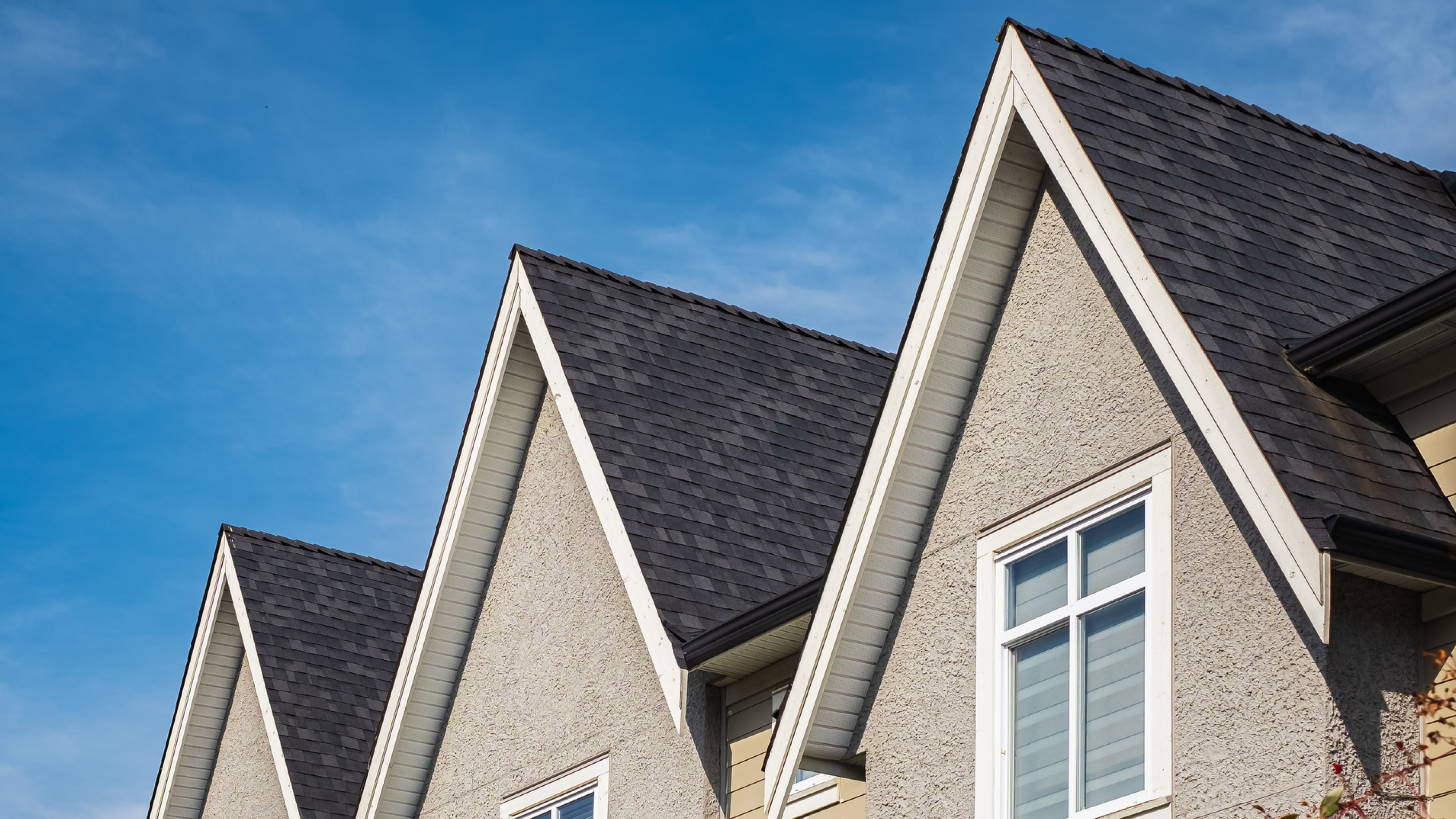
The Warm-Cool Rule for Roof and Siding
Once you know your roof color, the most reliable pairing principle is simple: match warm to warm and cool to cool.
Warm colors carry yellow, orange, red, brown, or gold undertones. Tan roofs, brown roofs, and aged wood shingles are warm. Cedar-toned, cream, terracotta, and warm gray sidings belong in the same family and pair naturally with them.
Cool colors carry blue, green, white, or gray undertones. Charcoal roofs, blue-black architectural shingles, and slate-toned roofing are cool. Soft whites, cool grays, blue-grays, and sage greens pair naturally with them.
Mixing a warm roof with a cool siding color tends to create visual tension that reads as a mismatch, even when neither color is wrong on its own. The undertone conflict is subtle but noticeable, especially in photographs and at a distance.
There is one reliable exception: strong contrast can work across the warm-cool divide when the palette is anchored by a true neutral. A bright white trim, for example, can bridge a cool-toned roof and a slightly warm siding because white reads as neutral in most lighting conditions.
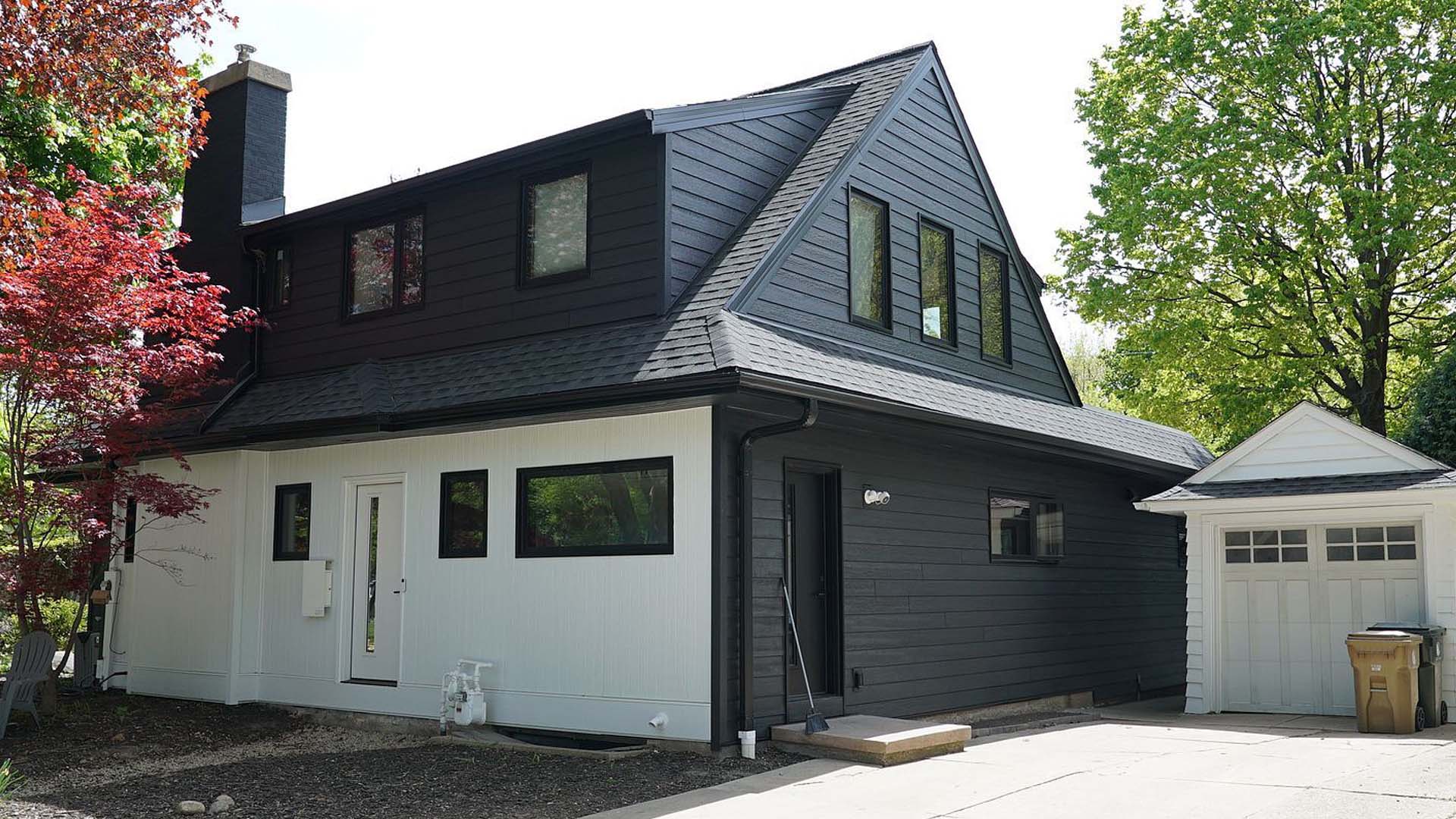
How Trim Color Controls the Whole Palette
Trim is the element most homeowners underweight in a siding installation color decision, and it has more visual influence than almost any other element on the facade.
Trim color determines how much contrast your siding reads against the rest of the house. White trim creates high contrast against any mid-to-dark siding, which makes the siding appear bolder and the architecture more defined. A trim color that is close in value to the siding creates a low-contrast, monochromatic effect that reads as quieter and more modern.
Before choosing a siding color, decide how much contrast you want the finished house to project. High contrast tends to read as traditional and well-defined. Low contrast tends to read as contemporary and understated. Neither is better, but the decision has a direct effect on which siding colors will work.
Also consider whether your doors, shutters, and garage doors are staying. These accents are part of the palette. A front door color that worked against your old beige siding may not work against a new dark gray, and replacing a front door is a far smaller project than reversing a siding color you do not like.
Let Your Home's Architecture Guide the Direction
Architectural style is one of the most reliable indicators of which color families will work on a given home. Fiber cement siding is available in enough profiles and color options to suit virtually any style, but the style itself narrows the range of combinations that feel intentional versus accidental.
Traditional colonial and craftsman homes in Wisconsin and northern Illinois tend to perform best with classic combinations: warm whites or creams with dark roofs, or earthy tones with complementary trim. These homes have symmetrical, defined architecture that rewards color combinations with clear contrast and clean edges.
Ranch-style homes have a lower, horizontal profile that benefits from colors that emphasize length rather than height. Mid-tone neutrals with slightly contrasting trim can reinforce the horizontal lines of the home without making it feel squat.
Contemporary and modern farmhouse styles have more flexibility with bolder choices. Dark charcoals, deep navies, and warm black shades have become popular in these applications, particularly paired with white trim and black or bronze hardware accents.
Florida homes face a different architectural context. The combination of intense UV exposure, high humidity, and the stucco-adjacent aesthetic common in Tampa and Clearwater neighborhoods tends to favor lighter, heat-reflective palettes. Soft whites, warm grays, and coastal tones perform better both visually and practically in Southern climates.
Your Neighborhood Is Part of the Decision
A color that looks exceptional on a home in isolation can feel jarring when it does not belong to the neighborhood's visual vocabulary. This is not an argument for conformity. It is an argument for context.
Walk your street before you finalize a color direction. Note the dominant tones in the neighborhood. If the majority of homes read as warm neutrals and earth tones, a home that departs significantly from that palette will stand out, which can be a feature or a liability depending on your goals. If you are planning to sell within five to seven years, standing out in a way that buyers do not expect can slow your sale.
If your neighborhood has a homeowners association, color restrictions may apply. HOA guidelines often specify approved palettes or require approval before exterior changes. Confirm this before any color decision is made. Discovering a restriction after siding installation begins is an expensive problem.
Resale Value and Color: What Buyers in the Midwest and Florida Actually Want
Residential siding color has a measurable effect on resale perception, even when buyers cannot articulate exactly why one home photographs better than another or feels more move-in ready at the curb.
The colors that consistently perform well at resale are not necessarily the most interesting ones. Warm neutrals, classic grays, and soft whites dominate the high-performing exterior palettes in the Midwest and Florida markets because they read as well-maintained, broadly appealing, and visually clean in listing photography.
Bold colors are not automatically a liability. A well-executed deep navy or dark green on a home with clean trim and a complementary roof can stand out positively. But a bold color choice that conflicts with the roof, mismatches the trim, or reads as dated is harder to overlook for buyers who are comparing multiple homes.
If you are confident you are staying in the home for ten or more years, color for your own preferences. If you have a shorter time horizon, the safest investment is a color palette that photographs well, belongs to the neighborhood, and does not require explanation.
Test Before You Commit
No color chip, digital rendering, or online visualizer perfectly replicates how a siding installation color will read on your specific home in your specific light conditions. That said, testing options before fiber cement siding arrives on a truck is far less expensive than reversing a decision after installation is complete.
Order physical samples of your top two or three color candidates and hold them against your roof, your trim, and your foundation in different lighting conditions throughout the day. Colors shift significantly between morning and late afternoon light, and a tone that reads as neutral at noon can read as strongly warm or cool at dusk.
Both James Hardie and LP SmartSide offer online visualizer tools that let you test color combinations on home models before making a final decision. These tools are most useful for narrowing the field to two or three serious candidates, not for making a final call. Physical samples and professional consultation should follow.
Ridge Top's 3D Designer takes this further by letting you visualize color combinations on your actual home before a single board is installed. This step eliminates the most common source of post-project regret: a color that looked right in a sample binder but did not read the way the homeowner expected on the finished house.
How Ridge Top Takes the Guesswork Out
Choosing house siding color is a decision that affects how your home reads from the street for the next two decades. Ridge Top's design consultants guide every homeowner through the roof-trim-architecture-neighborhood framework before a color is selected. We do not hand you a binder and step back. We work through the palette with you.
Our 3D Designer tool lets you see your home in different color combinations before any material is ordered. Our siding service page covers the full range of materials and profiles we install across Wisconsin, Illinois, and Florida.
If you are ready to move from color decision to project estimate, our instant quote tool gives you a real number in minutes. Or schedule a free consultation and we will walk through the color selection process together at no pressure and no obligation. Learn more about how our process works from first contact through completed installation.
The right color is the one you will still be confident in ten years from now. That confidence comes from a decision made with a clear framework, not a lucky guess from a color chip.